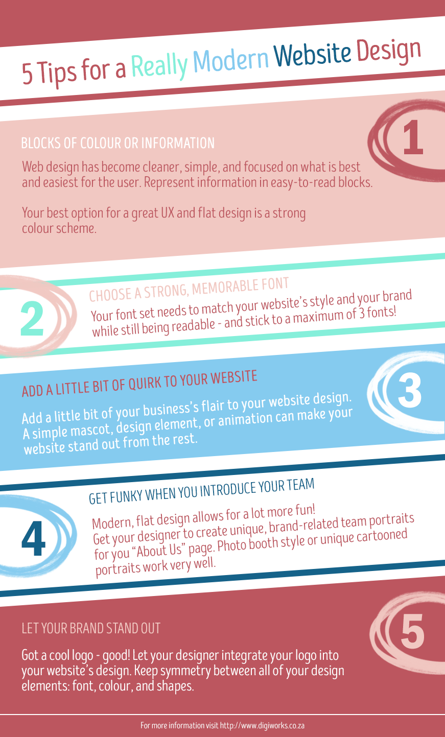
5 Tips for a Really Modern Website Design
Friday, September 25th, 2015
Whether you’re designing a new website, or revitalising your old one, modern website design is easy to get your head around. Once you get these five elements of modern design under your belt, you’re likely to have a beautiful website.
Make Modern website design work for you and your business
Modern website design and development has a focus on letting your users find the relevant information as easily and quickly as possible. Creating a synergy between your brand, your website design, and your website goals is the the end game in modern design.
The role of blocks of colour in modern website design
Colour is one of the most important element in a flat design. Because flat, modern website designs use simple shapes are rely more on the representative power of colour to portray information, one of your first, and most important, ports of call should be choosing a strong colour scheme.
Your colour scheme should:
- Include and complement your brand’s colour;
- Not exceed five main colours (excluding black and white);
- Always be carefully chosen with culture, societal, and psychological connotations in mind.
Choosing a memorable font set
While many people get a little nervous when it comes to choosing their fonts, you don’t have to be. If you have a logo to work with, you’re already a step in the right direction. Match fonts (or shapes in logos without writing) to your logo so that the over all design has a good synergy. If the font is very unique this could act as a heading font.
A well-rounded font set includes:
- A sans serif or serif font e.g. Calibri or Helvetica;
- A heading font that scales nicely and matches the logo;
Typically the sans serif or serif font will be used for the body text and heading (sizes, weights, and colours can change)
Quirky website design gives personality
Modern website design allows for a bit of fun. Try to infuse your website with the personality of the business its representing. A couple of quirky easter eggs here and there make all the difference when a visitor is trying to get to know the business behind the website.
Introduce your team the right way
Introducing the company’s workforce can be done is a number of creative ways – and should always match the tone, level of quirk, and brand of your website. Everything from unique animated versions of the team, to a photo shoot with a number of dress-up options is a great start to an awesome “Meet the Team” or “About Us” page.
Make your brand stand out in your design
Creating a website from a particular brand, especially when it’s an established brand is important for continuity. While colour schemes and tone are helpful guides, the shapes and use of white space in logos can be a big nudge in the right direction.
Get more on website design and development from the Digiworks Blog!


