13 Parts of a Website You Should Know About
Thursday, October 22nd, 2015
You’re interested in having a website created, but you’re not sure what goes into a website? There are 13 important parts of a website to know about. Get clued up and help create the website of your dreams!
13 Basic parts of a Website
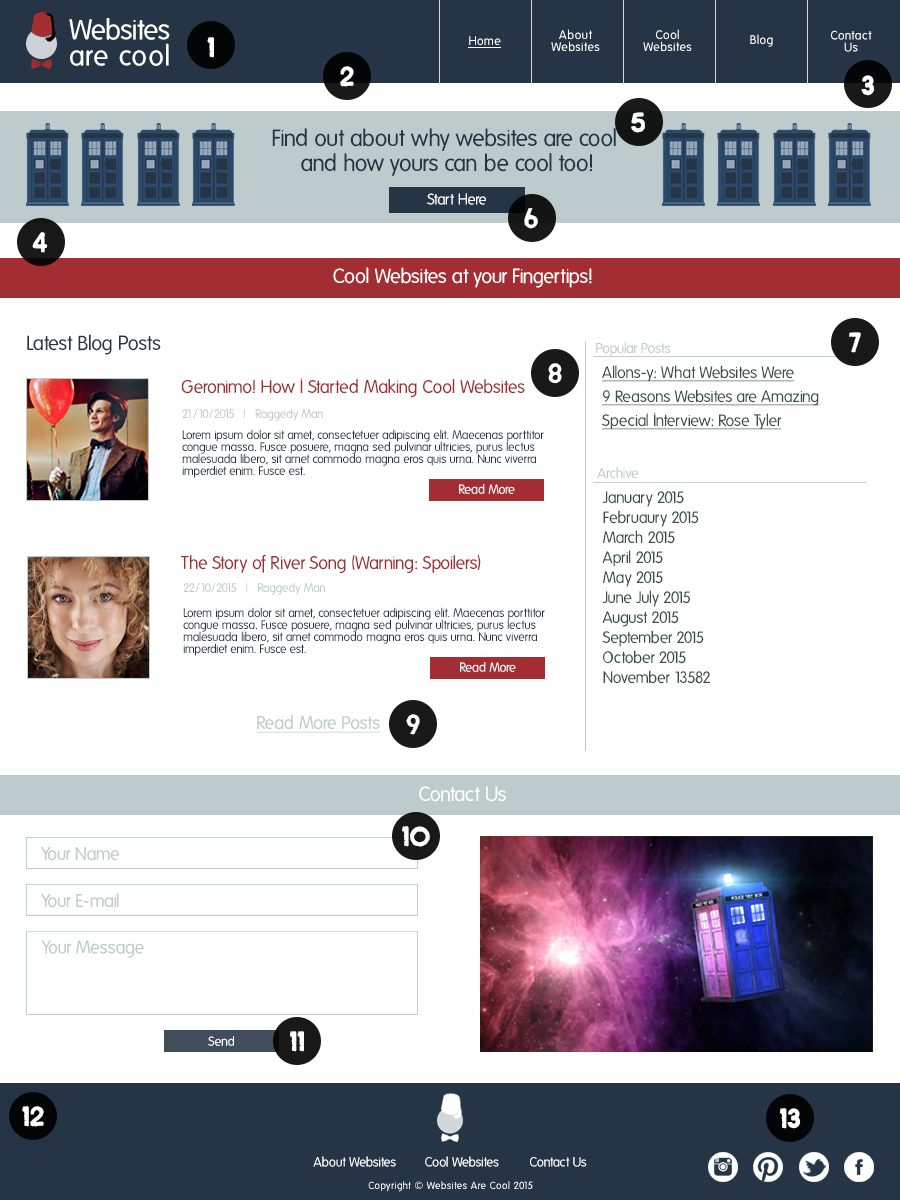
The following is a basic home page of an example website. While many of the parts of a website are represented in this image, these are not the only website constituents available to you when designing your website. This post aims at getting you clued up on how a website works – but always consult your web designer (because they will know what’s best for your website).

1. Website logo
The logo section of the website will commonly be the space for identifying the website brand. While personal blogs and other non-brand-driven websites may only include the name of the website here, this spot is the first point of call for establishing a brand on the website. This image or text is often linked to the website main page, often known as “home”.
2. Header
The header is the top portion of the website, often containing the website logo as well as the main menu. The header is often a permanent fixture of the website, where the main content might scroll beneath it. The header contains information that is important to website navigation.
3. Menu
Menus, often placed at an easy-to-reach place on the website, provide a way to navigate the website in an easy way. A main menu is often contained in the header, or on a collapsible pane (especially in mobile views of websites), and allows navigation through the pages of the website.
4. Body
The body area of a website is the area of the website that contains the most content. There are a number of different kinds of content. Specific pages will contain specific content. The home page depicted contains examples of these types of content in ways that would be displayed on a home page.
5. Highlighted content
Highlighted content, often exclusively on the home page, guides visitors to parts of your website that will convert into website goals. Website goals are the actions, interactions, etc. on your website that fulfil the very purpose of your website. Booking a flight on a travel agent’s website, or buying goods on an online store are examples of this.
6. Call To Action (CTA)
CTAs are important for guiding visitors to your website to important information, completing website goals, and navigating your website. CTAs can be obvious, such as buttons, or more subtle, like linking within text, but all serve the same purpose: guiding visitors to information that is relevant to them.
7. Sidebar
While many modern websites with flat design elements frame the body content within the full width of the website, sidebars are very common website elements that haven’t disappeared entirely. Sidebars, like menus, often help with navigation. When large amount of information, like multiple blog posts, or products need to be ordered, a sidebar can help. Sidebars are often used in displaying related bits of information, contain CTAs, or guide visitors to the next step after they’ve read a post or added a product to their cart (for example).
8. Posts and “feed” content
A handy way to get visitors to your website engaging with the content on your website is by offering a “feed” of content. This, like a slideshow of recommended products or, in this case, the latest blog posts, serves to pique the visitor’s interest and guide them to completing website goals (in the case of the dummy website, reading a blog post).
9. Internal Links
Internal links are useful for creating an ideal flow through your website. In the example, the link takes users to the blog page, where they can peruse the full list of blog posts and find something that interests them and effectively completing a website goal. Sidebar content and highlighted content CTAs are another way of achieving the same thing, with an even more effective attention grabbing effect.
10. Forms
Forms are ideal ways of gathering information from your visitors. Contact forms are very common, and work to get the name and a means of contacting visitors at the very least. Sign-up forms, application forms, shipping information forms, and the like are other examples of how forms are used on websites. Forms are an easy and intuitive way for your visitors, from whatever level of technological background, to get the correct information to you.
11. Buttons
As CTAs, prompts to complete an interaction like a form, or simply as a link to another part of your website (menus use this often) buttons are handy interactive parts of your website that prompt engagement. Unique styling to these parts of the website can be helpful in brand building, highlighting the CTA related, and guiding the visitor’s eye to a particular piece of information.
12. Footer
The footer is the round-up of the website. Typically the footer will contain important links on the website, or, sometimes, links to all of the pages of the website. A copyright and date stamp is common, to protect the information on your website and let visitors know when your website was last updated. Any other pertinent information – perhaps a mini contact form, a CTA, a scrolling photo gallery, or any other permanent information you would like to display at the end of every page – is contained in the footer.
13. Social links
Social media links are a popular addition to most websites. While the example show the links in the footer, social media links can be displayed on any part of the website. If a visitor likes your website, wants to get updates from your website via social media, or simply prefers getting in contact via social media, these links will prompt further engagement with your website.
A social media presence is almost essential to creating and maintaining a brand online and is a huge help with engaging with your online audience.
Have more questions about websites? Feel that we left something important out? let us know in the comments below or by completing our contact form.

